Made In L.A.
Leading up to the biennial event, "Made in L.A.", the Hammer Museum wants to create a Mixed Reality product that will allow Angelinos to participate in building communal art (in the MR field) while exploring their city in new ways. The product will feature the neighborhoods each featured artist works in, and like Pokemon Go, the users will need to physically travel to those spaces to view the artist’s work, and co-create pieces in that space with others.

Exploratory Research
Given that our app was going to use augmented reality on their phones along with interacting with artists/art in some way, it was important that we talk with individuals that are both technologically savvy as well as someone who attends art events. We decided that the best way to find these people was to go to the Hammer Museum ourselves and talk with the people observing the art exhibits.
Exploratory Research #2
We also made a short survey that we sent out on social media asking our friends about about their experiences with art.
- How much do you inquire about the artists and their art?
- How do you support or engage with artists?
- What do you know of LA’s art community?
- What is your experience with Augmented Reality?
Interview Insights
“My experience adds to the art piece”
- George, UCLA Student
“I’m bothered when art pieces don’t have descriptions
because I like knowing the story behind the art”
- Crystal, PhD candidate film composition
“Even when I don’t fully understand the art piece,
knowing more about the artist and the inspiration
behind the piece really interests me.”
- Kiet
Design Studio
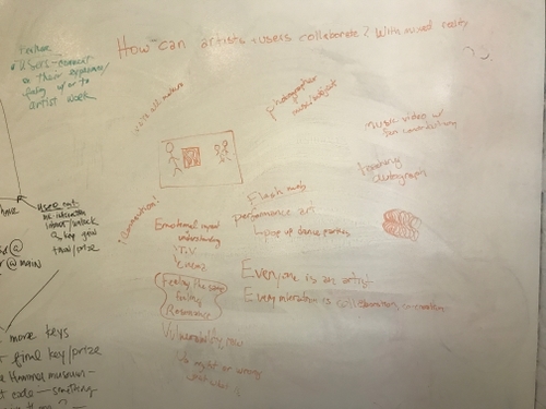
We brainstormed ideas and concepts on how we can encourage people to travel the city while learning about the artist and interact on some level using augmented reality. We defined the KPI that will measure the success of the app.


User Flow
I brainstormed different designs to get an idea for a design feel and language. The more iterations I made the better the concepts became.
Art Direction
I brainstormed different designs to get an idea for a design feel and language. The more iterations I made the better the concepts became.


Testing #1
We brought our app to potential users, having them go through the flow of learning about the artist, interacting in their space, and viewing the unlocked work by the artist in "collections".
- Make copy more legible.
- Use consistent language.
- lessen the cognitive load.

Testing #2
After making the corrections from our first test, we tested a different group of users to see if the changes we made were more successful.
Final Concept
After all our research, testing, iterations and more testing, we believe that our design accomplishes the Hammmer Museum's desires along with the desires of our user. With our app, users will be able to travel to different zones around the city that are inspired by the artist from that area. Once they enter an artist's zone they will then be able to interact using augmented reality. Each zone will give the user different capabilities based on the artist and what inspires their work.

Every year "Made in L.A." has a tagline that embodies the event. "All Eyes on Art" was the tagline I chose, which I placed inside a white circle that creates a distortion on the phrase. To me this represents the community of Los Angeles coming together to look and participate in art through an augmented reality medium.

When the user chooses to explore they are brought to a description page that explains what the map they are about to see is depicting and what they can expect when they travel to the highlighted zones.

When they cross into an artist's zone they will be alerted about which artist's zone they have entered into, where they can then read more about the artist or learn how to participate in that zone.

The user will go through a quick onboarding process to not only learn about how to interact in the space they just have entered but why.

Once the user has entered the artist's zone he/she will be able to look around using his or her phone and see other people's sculptures along with the ability to create their own.

The user will be guided through the interaction process through augmented illustrations.

Once the user has participated they will be rewarded with a thank you message and a notification that they have unlocked work by an artist that they can view in their collections. This is where we will encourage the user to make an account in order to save their progress because they are much more likely to follow through with signing up now that they have something to lose.